Contact us
The OAC, Office 1, 2nd Floor, Frederick St,
Loughborough,
LE11 3BJ
Nathan had plenty of ideas about what he wanted the space to look like so we worked with him to align and rationalise his thought process, develop a brand identity (with our branding partners @strategy plus) and create a concept that embodied it all. We began with a series of moodboards and worked together to refine it to one that reflected the direction we were all happy to go in.
Alongside the moodboard, we worked on a layout and were in safe hands with the survey carried out by local practice @Urbandesigns. The space isn’t huge so it was about being clever with space planning. Process wise, we treat it like a jigsaw puzzle, ensuring the key parts work first, i.e., kitchen, WC’s, bar and storage requirements and then we work everything else around it. We ended stage 1 with a GA plan and a refined moodboard that everyone was happy with.
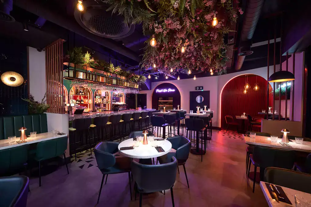
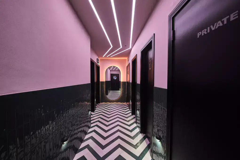
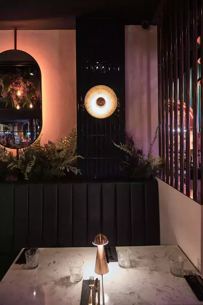
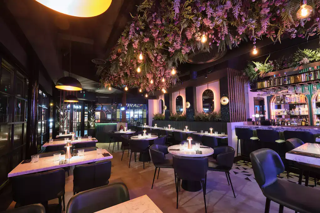
Next came the exciting part – designing the space and creating the 3D visuals. Using the mood board as a starting point, we formed the concept. We combined industrial elements with luxurious finishes to reflect the chic look Nathan was going for while ensuring it didn’t feel too pretentious or contrived.
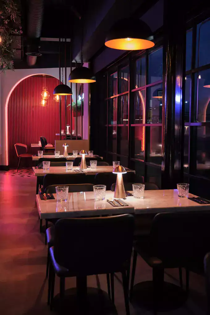
Prior to being Isabel’s, the property was a retail store so one of the big challenges we knew we would face, was what to do with the full height windows that ran across the venue. To tackle this we layered up the window finishes to ensure the ambience felt intimate enough on the inside while creating some mystique from the outside. A full height timber frame sat on the inside face of all the windows along with a tinted vinyl at half height. We also incorporated subtle window decals to add a layer of branding.
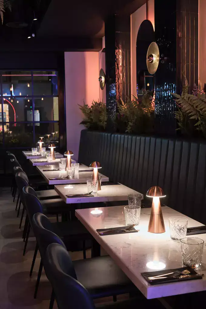
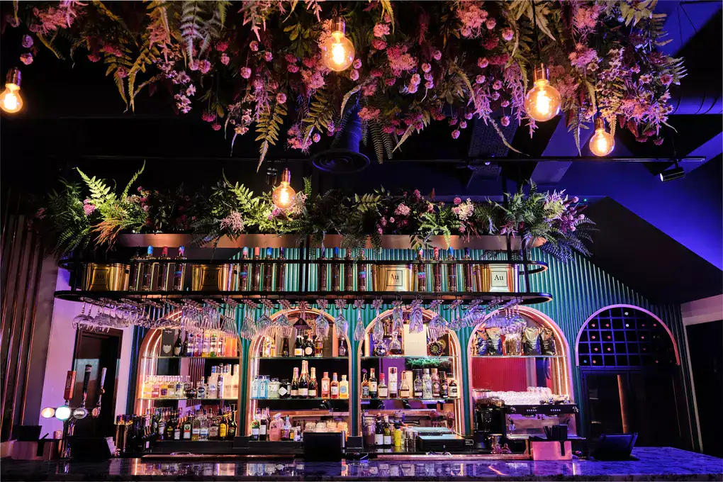
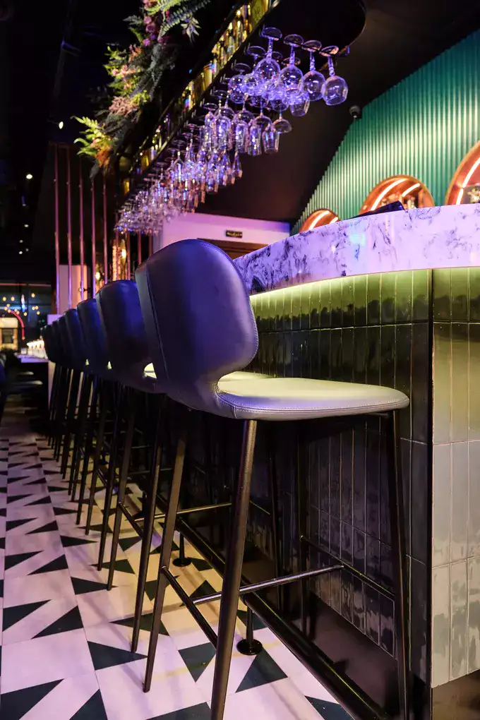
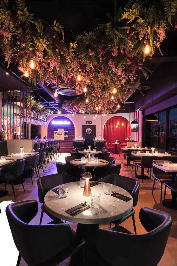
Lighting was key for Nathan; he wanted to ensure that the space covered it all, from capturing the perfect selfie to switching up the mood day and night. We layered the lighting with pendants, track and table lights along with incorporating colour changing LED lights, picking out key features such as the bar alcoves, kitchen servery and the VIP area.
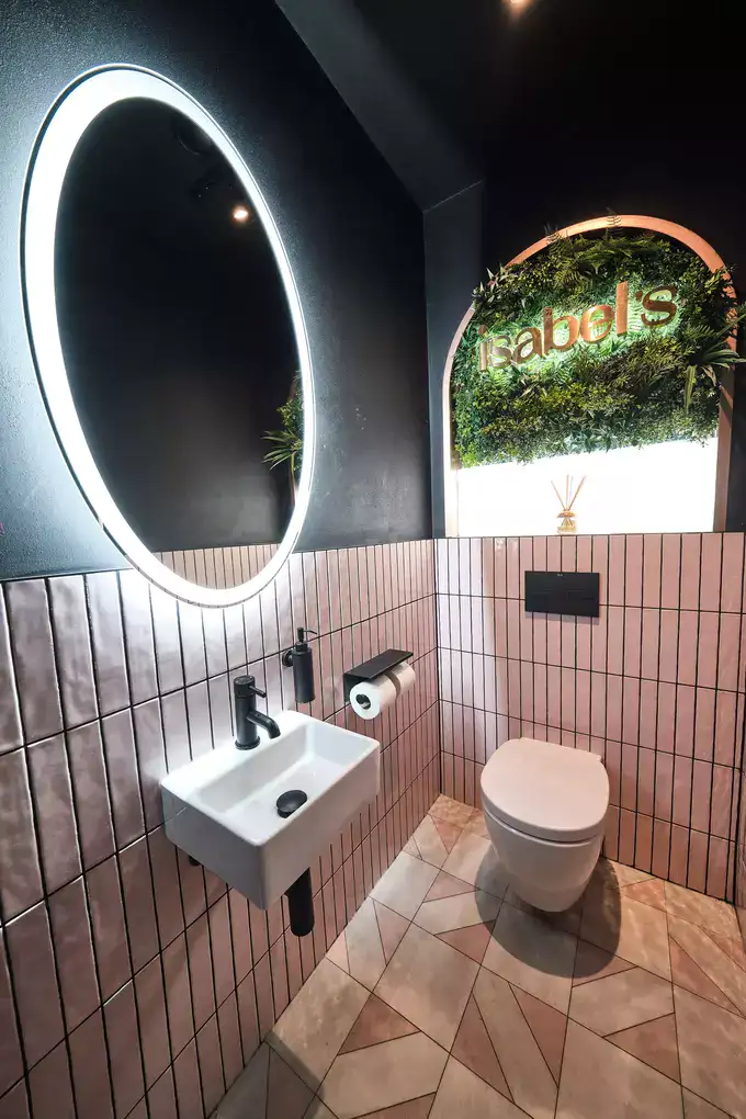
Nathan was keen to incorporate foliage, but we wanted to make sure we used it to create a style that was unique to Isabel’s. We opted for a variety of English meadow flowers, ferns and heathers to celebrate the femininity of the brand name whilst reflecting the local scenery. Nathan was blown away by the visuals for this unique concept, and we quickly proceeded to stage 3.
We took the design and made it work through a detailed drawing and specification pack. Where possible, we aim to produce visuals that reflect the finishes and products we will be specifying, so a degree of ‘thinking’ has already been done around this in stage 2.
We then worked with several suppliers to ensure everything aligned with the overall vision. From furniture suppliers, bar manufacturers, lighting specialists, kitchen fabricators and planting suppliers, a great deal of liaison time is spent specifying the right product and finish to ensure the correct look is achieved, as well as optimising the longevity of a product.
The majority of the contractors were friends of Nathan, so he chose not to go down the traditional route of going to tender. However if he had wanted to, the drawing pack and visuals would be all he needed o get accurate quotes from contractors.
We factored in several visits to oversee the build throughout the weeks on site. We also liaised with Nathan and the project manager to ensure we were visiting at key times of the install. We always like to be on site when key elements like the planting and furniture arrive to ensure everything runs smoothly and to our specifications.
We’re incredibly proud of what we all achieved together at Isabel’s. Nathan put 100% trust in us, and was a delight to work with. Knowing your client has faith in you and the design means the world, and as a result, the outcome has not only exceeded expectations, but looks absolutely amazing too.
